From poor user experience to ineffective visual elements, we’ll delve into real-world examples, offering actionable insights to help you navigate the complexities of web development. Gain a comprehensive understanding of bad web design practices and discover practical solutions to elevate your digital creations. This article explores fourteen signs of bad web design and poor development practices, offering in-depth insights from TRS experts who adeptly navigate these challenges. By uncovering these common mistakes of bad web design, our goal is to provide you with valuable insights that will not only enhance your appreciation for good design but also equip you with the knowledge to avoid these critical missteps in your web projects.
The TRS team collaborates to create websites that not only look impressive but also operate seamlessly, recognizing the dynamic nature of web development. This comprehensive guide delves into the experiences of TRS developers, providing valuable insights into addressing issues to resolve both bad web design and development.
14 Signs of Bad Web Design with TRS approach to solve these issues
- 1. Poor Navigation
- 2. Slow Loading Time
- 3. Non-Responsive Web Design
- 4. Cluttered-User-Interface (CUI)
- 5. Lack of Call-to-Action (CTA):
- 6. Inconsistent Branding
- 7. Accessibility Issues
- 8. Lack of Cross-Browser Compatibility
- 9. Inadequate Security Measures
- 10. Unoptimized Code and Performance Issues
- 11. Limited Scalability
- 12. Incomplete Testing Procedures
- 13. Ineffective-Content-Management
- 14. Lack of Mobile Optimization
- Good vs Bad Web Design
- Good Web Design & Development Elements
- Bad Web Design & Development Principles
- Conclusion: Avoid bad web design with TRS
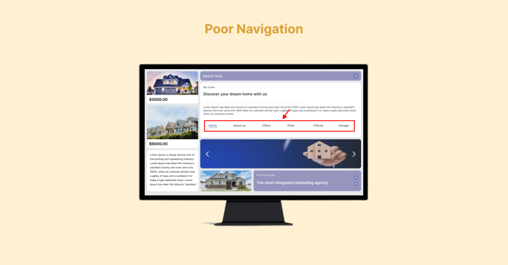
One of the most prevalent challenges faced by developers is poor navigation. When users struggle to find information or navigate through a website seamlessly, it’s a clear indicator of bad design. This refers to a website’s inability to provide a user-friendly experience in terms of finding information. It includes confusing menu structures, unclear labels, or a lack of logical organization, hindering users from easily navigating through the site.
How to fix poor navigation
Emphasizing the critical importance of intuitive menus, clear labels, and a logical site structure to enhance the user experience. An intuitive navigation system ensures that users can effortlessly access the information they seek, contributing to a positive overall impression.
Unable to unsubscribe from emails quickly, efficiently.
There’s an examples of bad web design source from YouTube Link:
Difficulties accessing important account settings, leading to frustration. This refers to a website’s inability to provide a user-friendly experience in terms of finding information. It includes confusing menu structures, unclear labels, or a lack of logical organization, hindering users from easily navigating through the site.

In the fast-paced digital age, users expect websites to load quickly. Slow loading times can lead to frustration and search engine rankings. Slow loading times indicate that a website takes an extended period to display its content. This can be caused by large image files, inefficient code, or server-related issues, negatively impacting user experience and potentially leading to higher bounce rates.
How to fix slow loading time
Stressing the significance of optimizing images, leveraging browser caching, and minimizing unnecessary scripts to ensure a swift and efficient user experience. An optimized website not only enhances user satisfaction but also contributes to improved search engine performance.
Related: To slow speed 8 STEPS TO CODEIGNITER PERFORMANCE OPTIMIZATION.
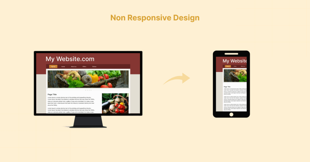
Non-responsive design means the website does not adapt or display properly on various devices, particularly mobile devices. A responsive design ensures that the layout and content adjust according to the screen size, providing a seamless experience across all platforms. With the increasing use of smartphones and tablets, having a non-responsive design is a major flaw.
How to fix non-responsive web design
Highlighting the importance of responsive web design to ensure that websites look and function well on various devices. A mobile-friendly design is not just a trend but a necessity for engaging today’s diverse audience. By adopting responsive design principles, websites can provide a consistent and enjoyable experience across a wide range of devices, catering to the preferences of modern users.

A cluttered UI occurs when there is an excessive amount of information, elements, or design components on a webpage. This can overwhelm users and make it challenging for them to focus on the essential content or actions and distract them from the core content.
How to fix CUI
TRS developers stress the importance of a clean and organized design, with a focus on essential elements. Consistent typography, color schemes, and well-defined whitespace contribute to a visually appealing and user-friendly interface. Clear visual hierarchy and simplicity in design not only enhance aesthetics but also guide users through the content seamlessly.
A website without clear calls-to-action is like a ship without a rudder. A website lacking clear CTAs fails to guide users toward desired actions, such as making a purchase or filling out a form. Effective CTAs should be strategically placed, visually prominent, and provide a clear path for users to follow.
How to fix CTA
TRS developers highlight the importance of strategically placed CTAs to guide users toward desired actions, whether it’s making a purchase, filling out a form, or subscribing to a newsletter. A well-designed website should seamlessly lead users through the desired conversion funnel. Strategic placement, compelling visuals, and persuasive copywriting contribute to effective CTAs that drive user engagement.
Related: Download our free CTA builder plugin for WordPress.
In the age of mobile browsing, neglecting mobile optimization is a clear sign of poor development. The lack of mobile optimization indicates that a website is not tailored for mobile devices. With a growing number of smartphone users accessing websites, mobile optimization involves implementing responsive design principles and ensuring a consistent user experience across different screen sizes.
How to fix lack of mobile optimization
TRS developers stress the importance of implementing responsive design principles, optimizing images and media for mobile devices, and ensuring a consistent user experience across all screen sizes. Mobile optimization is not only about adapting to different screen sizes but also about creating a user-centric experience that aligns with mobile browsing habits.
To make sure that your users have the best mobile optimization experience, follow the best practices detailed in this guide: Mobile site and mobile-first indexing.
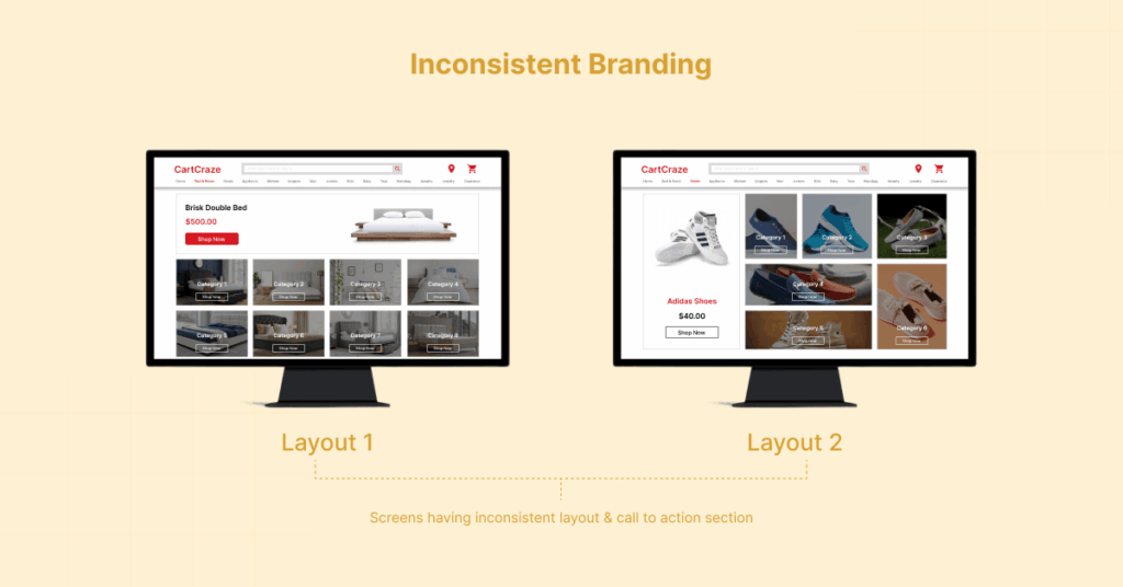
Inconsistent branding involves variations in visual elements, messaging, or tone across different pages of a website. This inconsistency can confuse visitors and weaken the overall brand identity, impacting trust and recognition. Maintaining a consistent brand identity across all pages is crucial for building trust and recognition.
How to fix inconsistent branding
TRS developers emphasize the importance of using consistent color schemes, logos, and messaging to reinforce brand identity. Inconsistencies can confuse visitors and diminish the overall impact of your website. A unified brand presence, on the other hand, fosters trust, recognition, and a sense of reliability among users.
Accessibility is a key aspect of good web design often overlooked. Accessibility issues arise when a website is not designed to accommodate users with disabilities. This includes features like alternative text for images, keyboard navigation, and ensuring content is presented in a way that can be easily understood by a diverse audience.
How to fix accessibiliy issues
TRS developers stress the importance of creating websites that are accessible to users with disabilities. This includes providing alternative text for images, ensuring keyboard navigation, and making sure that the content is perceivable, operable, and understandable by a diverse audience. An inclusive design approach not only caters to a broader audience but also aligns with ethical considerations in web development.
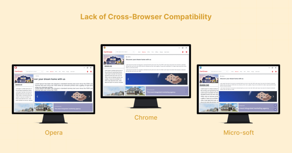
Poor development practices often manifest in the form of websites that do not function consistently across different browsers. Cross-browser compatibility issues occur when a website functions well in one browser but experiences problems in others. Ensuring compatibility across popular browsers like Chrome, Firefox, Safari, and Edge is crucial for reaching a broad audience.
How to fix lack if cross-browser compatibility
TRS developers emphasize the importance of thoroughly testing websites on various browsers to ensure a uniform and reliable user experience for all visitors. Cross-browser compatibility testing is crucial for addressing variations in rendering and functionality, providing a seamless experience regardless of the user’s browser choice.
Security is a paramount concern in web development. Inadequate security measures involve neglecting fundamental security practices, such as not implementing HTTPS, infrequent security audits, or using outdated software. This leaves the website vulnerable to potential cyber threats and compromises user data.
How to fix inadequate security measures
TRS experts highlight the risks associated with poor security practices, such as not implementing HTTPS, neglecting regular security audits, and using outdated plugins or frameworks. A secure website not only protects user data but also builds trust among visitors. Implementing robust security measures is an ongoing commitment that safeguards both user information and the overall integrity of the website.
Website speed and performance are critical factors influencing user satisfaction. Unoptimized code and performance issues refer to inefficient programming that can slow down a website. This includes redundant code, inefficient database queries, and server-related problems, all of which contribute to suboptimal website performance.
How to fix unoptimized code and performance issues
TRS developers stress the need for clean and optimized code, efficient database queries, and proper server configurations to ensure swift loading times. Neglecting these aspects can result in a sluggish website, leading to high bounce rates. Optimizing code and addressing performance issues contribute to a seamless and enjoyable user experience.
A sign of poor development is a website that struggles to handle increased traffic and data over time. Limited scalability indicates that the website struggles to handle increased traffic or data over time. A well-developed website should have a scalable architecture, efficient databases, and caching strategies to accommodate growth without sacrificing performance.
How to fix limited scalibility
TRS experts emphasize the importance of building scalable architectures, using efficient databases, and employing caching strategies to ensure that websites can adapt and grow as the business expands. Scalability is a crucial consideration for long-term success, allowing websites to accommodate growth without compromising performance.
Bonus: Use AWS Lambda functions to help resolve scalibility issues.
Insufficient testing can lead to a myriad of issues, from broken links to functionality errors. Incomplete testing involves neglecting comprehensive testing processes during development. This can result in undetected bugs, broken links, or functionality errors, ultimately leading to a subpar user experience.
How to fix incomplete testing procedures
TRS developers stress the need for comprehensive testing, including unit testing, integration testing, and user acceptance testing. Failing to identify and rectify bugs during development can result in a subpar user experience. Rigorous testing procedures are essential for delivering a flawless and reliable website to end-users.
Related: To optimize your API testing check out here Introduction to API Testing
A poorly developed content management system (CMS) can hinder the ability to update and manage website content efficiently. Ineffective content management refers to difficulties in updating and managing website content. A well-developed content management system (CMS) should allow for easy content updates without compromising the website’s performance or security.
How to fix ineffective content management
TRS experts highlight the importance of selecting or developing a CMS that meets the specific needs of the website, ensuring easy content updates without compromising performance or security. An effective CMS streamlines content management tasks, allowing website administrators to keep information up-to-date with ease.
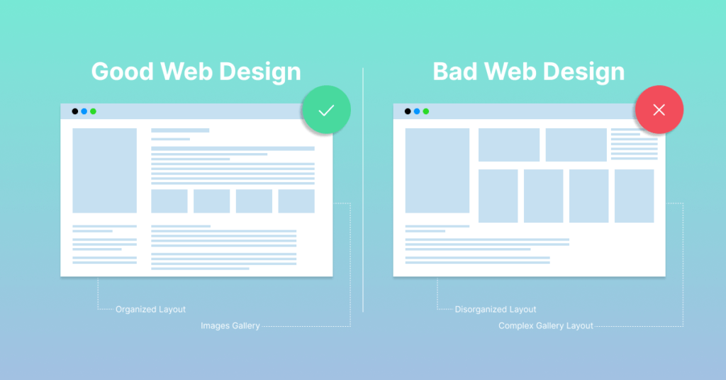
In the realm of web design and development, the distinction between good and bad practices is crucial for the success of any online venture. Good web design is characterized by intuitive navigation, swift loading times, responsive design, clean UI, effective CTAs, consistent branding, accessibility features, cross-browser compatibility, robust security measures, optimized code, scalability, thorough testing, efficient content management, and mobile optimization.
On the flip side, bad web design and development practices result in poor navigation, slow loading times, non-responsive design, cluttered UI, a lack of CTAs, inconsistent branding, accessibility issues, cross-browser compatibility issues, inadequate security measures, unoptimized code, limited scalability, incomplete testing procedures, ineffective content management, and a lack of mobile optimization.
Understanding and implementing the principles of good website design and development are paramount in creating a positive user experience, building trust, and achieving online success.
As TRS continues to navigate the complexities of the digital landscape, the commitment to excellence remains unwavering, setting a benchmark for what constitutes not just acceptable but exceptional website design and development.
- Intuitive Navigation: A good website features a clear and intuitive menu structure, making it easy for users to find information. For example, websites like Apple and Amazon excel in providing straightforward navigation.
- Swift Loading Times: Optimized images, efficient coding, and minimal scripts contribute to quick loading times. Google is a prime example, loading almost instantly, enhancing user experience.
- Responsive Design: Websites like Airbnb and Starbucks adapt seamlessly to various devices, offering a consistent and user-friendly experience.
- Clean UI: Platforms like Medium boast a clean and organized UI, focusing on essential elements, consistent typography, and well-defined whitespace.
- Effective CTAs: Well-placed and clear calls-to-action are evident on sites like HubSpot and Dropbox, guiding users through the conversion funnel.
- Consistent Branding:Coca-Cola and Nike maintain consistent branding across their websites, reinforcing brand identity effectively.
- Accessibility Features: Apple incorporates accessibility features such as voiceover and screen adjustments, ensuring inclusivity for users with disabilities.
- Cross-Browser Compatibility: Websites like BBC and Microsoft ensure a uniform user experience across different browsers.
- Poor Navigation: Websites with confusing menus, like outdated personal blogs, frustrate users, hindering information retrieval.
- Slow Loading Times: Sites with large, unoptimized images and excessive scripts, resembling amateur portfolios, lead to high bounce rates.
- Non-Responsive Design: Websites that don’t adapt to mobile devices, similar to some older government sites, offer a subpar experience to smartphone users.
- Cluttered UI: Some less professional e-commerce sites overload users with information, distracting from the core content.
- Lack of CTAs: Personal blogs or amateur sites often lack clear calls-to-action, missing opportunities for user engagement.
- Inconsistent Branding: Websites with mismatched logos, colors, and messaging, like poorly executed local businesses, fail to establish a strong brand identity.
- Accessibility Issues: Some websites ignore accessibility, excluding users with disabilities from accessing content effectively.
- Cross-Browser Compatibility Issues: Sites that display differently on various browsers, reminiscent of early internet forums, create a fragmented user experience.
As defined in the article, “The Right Software” (TRS) is committed to a comprehensive approach in addressing both bad website design and poor development practices. The overarching goal is to deliver holistic solutions that go beyond meeting aesthetic expectations to encompass high standards of functionality, security, and performance.
The TRS experts recognize the importance of focusing on key elements such as navigation, loading times, responsiveness, UI clarity, CTAs, branding consistency, and accessibility.
By diligently addressing these fourteen signs, the aim is not only to rectify issues but also to elevate the overall quality of projects undertaken by TRS. The holistic strategy is geared towards contributing to a positive and effective online presence for TRS clients. This involves ensuring that websites not only look impressive but also operate seamlessly, providing users with a positive and engaging experience.
By combining their expertise and addressing a spectrum of design and development challenges, TRS strives to set a high standard in the ever-evolving digital landscape.
Need help? If you think, your website is suffering from one or more of these bad web design practices or you are looking to have your website audited for bad web design, feel free to contact us.
Our team is ready to discuss your needs and tailor solutions that match your goals, ensuring your digital presence stands out in the ever-changing digital landscape.


